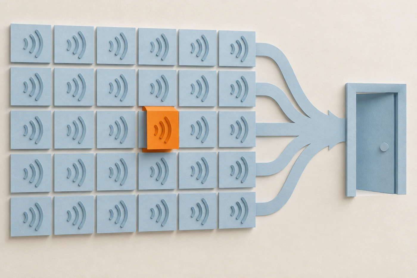
Voice user interface design is the work of shaping how people speak to a product and how it answers. As of November 2026, after 15 years of building for screens, my position is that most of the writing on it starts one question too late. It asks how to make voice good before asking whether voice should be used. I think voice earns its place only when hands and eyes are busy, the vocabulary is small, and being misheard is cheap. Where a mishearing is expensive, voice is the wrong interface. This page gives the test, a decision table you can run on your own feature, and the failure patterns that decide whether a voice interface is trusted or abandoned.
What is voice user interface design?
Voice user interface design is the practice of shaping how people speak to a product and how it answers: what it listens for, how it confirms, how it fails, and when it hands off to a screen. The craft is mostly about errors and boundaries, not about making the voice sound pleasant.
You will also see it called voice UI design, voice UX, or designing conversational interfaces. They overlap enough that I treat them as one discipline here.
I'll say up front what is observation and what is opinion. That voice recognition sometimes mishears is an observation anyone with a smart speaker has made. That mishearing is the thing to design around is my opinion, built from years of designing interfaces and watching people use them.
When is voice the right interface?
Voice is the right interface when three conditions hold. The person's hands and eyes are busy, the set of things they might say is small, and being misheard is cheap. Cooking with wet hands and asking for a timer fits. If any one condition fails, the case for voice weakens fast.
Take them one at a time.
Busy hands and eyes. Voice has a real advantage when the screen is unavailable: driving, cooking, carrying something. If the person could as easily tap, voice has no edge, and typing or tapping is usually faster and quieter.
A small vocabulary. "Set a timer for ten minutes" has a narrow range of meanings. "Find me something good for dinner" does not. The smaller the set of likely requests, the fewer ways the system can misread one.
A cheap mistake. If the system hears "ten minutes" as "two minutes," the person notices and fixes it. Nobody is hurt. That cost is what makes the first two conditions safe to rely on.
When is voice the wrong interface?
Voice is the wrong interface when being misheard is expensive, the vocabulary is open-ended, or the person needs to compare options. Payments, medical decisions, and anything hard to undo belong on a screen with a visible confirmation. Speaking is fast, but checking is slow, and checking is what these tasks need.
Spoken output is linear. You cannot skim it or glance back at a line you missed. A screen lets someone compare three options at once, and a voice has to read them out in order while the person holds the first in memory.
I've written about the cost of mistakes in healthcare simulation technology and in VR simulations in healthcare education. Those pages are about learning, not voice. The lesson I carry from that work is the same one: the higher the cost of an error, the more a design has to let the person see and verify what is about to happen. Voice makes that harder, so the bar for using it rises with the stakes.
What does a decision table for voice look like?
It looks like a short list of questions about the task, each tied to a verdict. Run your feature through it before you design a single prompt. The tasks below are examples I made up to show the shape, not data from a study.
| Question about the task | Favors voice | Favors a screen |
|---|---|---|
| Are hands or eyes busy? | Yes, driving or cooking | No, the person is at a device |
| How many things might they say? | A handful of commands | Open-ended, or many options |
| What does a mishearing cost? | A retry | Money, safety, or trust |
| Can the action be undone? | Easily | Not easily |
| Does the person need to compare? | No, one answer is enough | Yes, several at once |
| Does the setting allow talking? | Private or alone | Public, shared, or noisy |
Count the rows. If most land on the right, ship a screen. If the split is mixed, voice can start the task and a screen can finish it. That hybrid is the most common right answer I see.
A worked example: "Add milk to my list" scores well on every row. "Transfer five hundred dollars to Sam" fails on cost, undo, and setting. The first is a good voice feature. The second can still begin with voice, but the amount and the recipient should appear on a screen before anything moves.
How do you design a voice interface that fails safely?
Treat the mishearing as the normal case. Repeat back what you understood, ask for confirmation in proportion to the cost of being wrong, make every action undoable, and give the person an easy way out to a screen or a human. A good failure path matters more than a good voice.
Four decisions carry most of the weight:
- Confirmation scaled to cost. Do not confirm a timer. Always confirm a payment. In between, confirm when the cost of a wrong guess is more than the cost of one extra sentence.
- Repeat back in the person's words. "Setting a timer for ten minutes" lets them catch an error without having to ask what happened.
- Reversibility. A voice command with no undo is a mishearing waiting to hurt someone. I make the same argument for any AI feature in AI UX patterns.
- An exit. After two misses, stop guessing. Offer a screen or a person. Asking a third time makes things worse.
What should you test first?
Test the failure, not the success. Anyone can demo a voice feature working. The useful test is to speak the request badly, in a noisy room, with an accent the system has not heard, and see what it does next.
Then ask the cost question out loud with your team: if it hears this wrong, what happens, and who finds out? If the answer is "the person finds out right away and it costs nothing," build the voice feature. If the answer is "nobody finds out until later," put a screen in front of it.
The honest answer for most products is a mix. Voice for the quick, cheap, hands-busy moments, and a screen for everything that needs a second look.