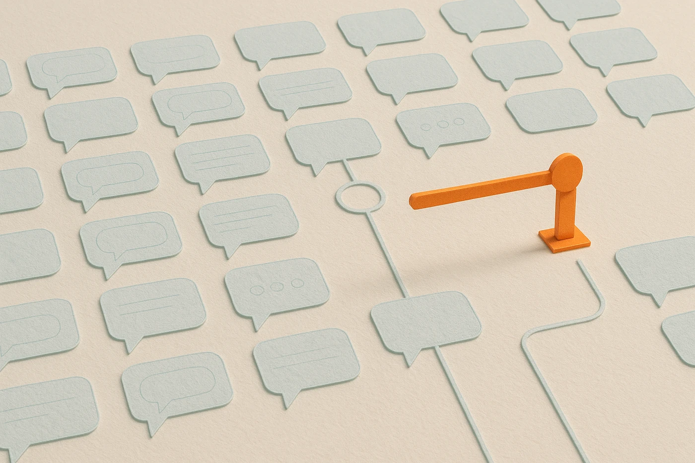
AI UX patterns are the small set of interface decisions, showing a preview before an action runs, making that action reversible, showing where an answer came from, and knowing when to hand off to a person, that decide whether someone trusts an AI product enough to keep using it. As of August 2026, after 15 years building products, including clinical simulation and platform tools where trust had to be earned before intelligence was even useful, I've stopped believing the pattern that matters is how the interface looks. The chat bubble, the typing dots, the sparkle icon: none of that is the product. The product is whether a user can tell, in the moment, what the system is about to do and how far they can trust it.
What are AI UX patterns?
AI UX patterns are the interface decisions that determine whether someone trusts an AI feature enough to keep using it: showing a preview before an action runs, making that action reversible, showing where an answer came from, and knowing when to hand off to a person instead of acting alone.
Most write-ups of AI UX patterns list surface conventions: streaming text, loading skeletons, a regenerate button. Those are fine details, but they're not what earns trust. The homepage of this site names the metric I actually design against: time-to-confidence. Not "does the AI work," but how long before the person in front of it knows what to do next. Surface conventions barely move that number. Structural guarantees do.
Why does a preview shorten time-to-confidence?
A preview turns a guess into a check. Instead of trusting the system's judgment about what it's about to do, the user trusts their own judgment about what they're looking at, which is a shorter, more reliable path to feeling safe enough to proceed.
GitHub Copilot's code review is the clearest version of this I've used. It doesn't ask you to trust the model's intent. It shows you the exact lines it wants to change and lets you read them like you'd read any other diff. That's a smaller cognitive step than "trust the AI," and smaller steps are what actually get taken under real deadline pressure. It's the same principle behind a well-built virtual patient case: the learner isn't asked to trust that the scenario is realistic. They're shown the exact vitals and history in front of them and asked to read those, the way they'd read a real chart.
Why does reversibility matter more than accuracy in an AI product?
Accuracy is an average over many uses. Reversibility is a guarantee about this one use. A system that's wrong 2% of the time but easy to undo feels safer than one that's wrong 0.5% of the time and hard to walk back, because the user only ever experiences one outcome at a time.
This is the same math I wrote about in decision-making under pressure: whether a move is reversible changes how much scrutiny it deserves before you take it. AI interfaces that skip a reversible design because the model is "usually right" are betting the whole relationship on an average the user never gets to see. One bad, un-undoable action erases a dozen good ones. ChatGPT's edit-and-regenerate pattern works for the same reason Copilot's diff does: it treats every output as a draft with a visible undo, not a final answer.
What does provenance actually mean in an AI interface?
Provenance means the interface shows where an answer came from, a document, a calculation, a model guess, and how confident the system is in it, instead of presenting every output in the same flat, authoritative tone regardless of how solid the ground under it actually is.
Most AI interfaces flatten this on purpose, because a single confident voice reads as more polished. That's backward for anything with real stakes. I built healthcare simulation products on the premise that a learner has to know the difference between a fact and a model's best guess, because in the field that difference is the whole job. An interface that can't tell the user "this came from the source document" versus "this is the model's inference" isn't being simple. It's hiding the one signal a careful user actually needs.
When should an AI product escalate to a human instead of acting alone?
Escalate when the stakes are real and the system's own confidence is low, or when the action can't be cheaply undone. The boundary has to be visible before the moment it's needed, not discovered by the user after the system already acted past it.
Intercom's Fin support agent is a decent public example: it answers routine questions on its own and hands off to a person when a query falls outside what it's confident about, and it tells the user that's happening. Intercom publishes the resolution and handoff outcomes as first-class metrics, which is itself the tell — a vendor treating the escalation boundary as a number worth reporting is a vendor that designed one. The failure mode I've watched more often is the opposite: a system with no visible boundary at all, so the user only learns where the edge was after it got crossed badly. Here's the table I actually use when I'm reviewing an AI feature before it ships, whether it's a product I'm building or one I'm just using:
| Pattern | What it protects | Failure mode without it | One way to build it |
|---|---|---|---|
| Preview | The user's sense of control | The action feels like it happened to them | Show the exact diff, write, or message before it commits |
| Reversibility | Trust after a wrong answer | One bad action erases many good ones | A visible undo, not a support ticket, for at least 30 seconds after |
| Provenance | Judgment about how much to trust an answer | Every output reads equally authoritative | Tag each claim: sourced, calculated, or inferred |
| Escalation | Safety at the edge of the system's competence | The user discovers the boundary after it's crossed | A named handoff to a person, offered before confidence drops too far |
None of these rows are hard to build. What's hard is deciding, before launch, which stakes are high enough to earn them. A low-stakes feature, a tone suggestion in a draft email, doesn't need an escalation path. A feature that writes into a patient record or a financial ledger needs all four rows, and it needs them visible, not buried in a settings page nobody opens.
The pattern I'd push back on if I heard myself arguing it five years ago: that a good enough model eventually makes these guardrails optional. It doesn't. The guardrails aren't a hedge against a weak model. They're the part of the interface that lets a person keep their own judgment in the loop, which is the actual reason anyone trusts a tool enough to keep using it past the first try.