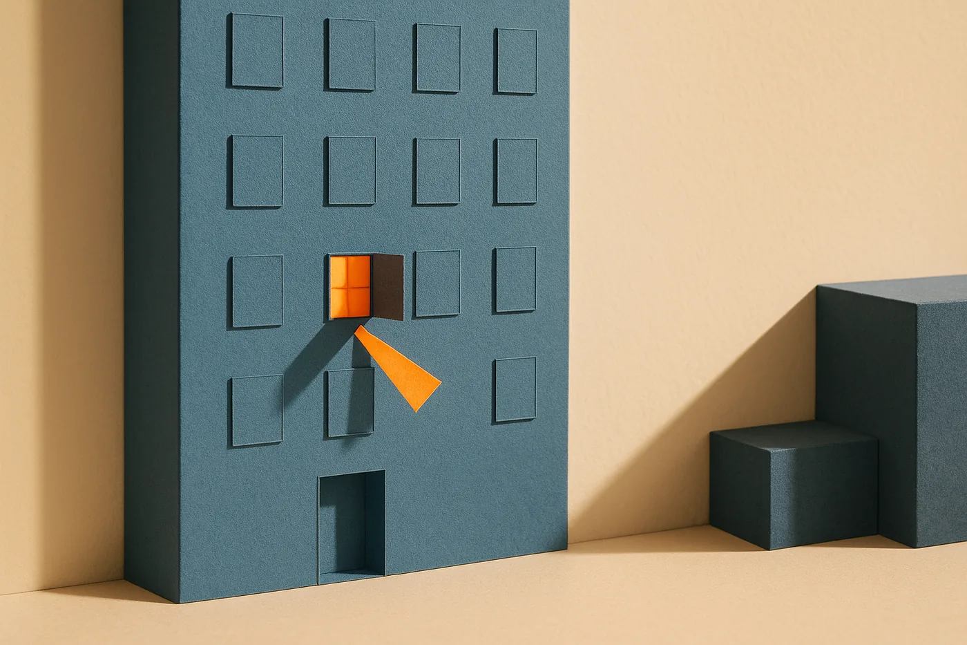
Emotionally intelligent design is the practice of building interfaces that acknowledge the human on the other side of the screen: their anxiety, their context, and their limits. It is not decoration and it is not persuasion. I published the original version of this article in 2012, back when "delight" was the word of the year. Fourteen years, several platforms, and one AI wave later, the argument matters more, not less. Software can now generate itself. What it still cannot do is care whether you succeed. The sites that feel alive are the ones built by someone who imagined a specific person, at a specific moment, feeling a specific thing. That is the soul. It was never the animations.
What is emotionally intelligent design?
Emotionally intelligent design means the interface responds to how a person feels, not only what they click. It anticipates anxiety at high-stakes moments, owns its failures in plain language, and remembers what you already told it. The test is simple: does the system behave like it knows a human is present?
In 2012, the fight was against decoration. Glossy buttons pretending to be feelings.
Today the fight is against scale. Interfaces are cheaper to produce than ever, and it shows. A generated page can be correct in every detail and still feel like nobody is home.
How do you design for emotion without manipulation?
Design for the user's emotional outcome, not your conversion metric. Manipulation engineers a feeling to extract a behavior. Emotional intelligence reduces fear, restores control, and tells the truth about limits. If the emotion you are creating only benefits you, it is persuasion wearing empathy's clothes.
Don Norman's three levels of emotional design explain why the cheap version fails. Nielsen Norman Group's account of divorcing a Nest thermostat traces the arc: visceral charm wins the purchase, behavioral betrayal ends the relationship.
Charm gets you the first week. Behavior gets you the years.
What are the 5 patterns of emotionally intelligent design?
Five patterns cover most of it: acknowledgment (the system notices you), proportion (the emotional register matches the stakes), honest failure (errors own the fault and name the fix), anticipation (calm at the anxious moments), and memory (never making someone repeat what they already said).
- Acknowledgment. Confirmation that a human arrived, not a session. A form that keeps your work. An error page that speaks like a person.
- Proportion. No confetti for trivial actions. No dead neutrality at painful ones.
- Honest failure. "We broke something, here is what to do" beats a cheerful shrug every time.
- Anticipation. Loading states, empty states, and irreversible actions are where anxiety lives. Design those first.
- Memory. Asking twice for the same information tells people the system was not listening.
In my product work, I measure time-to-confidence: how fast someone knows their next action. These five patterns are how an interface shortens it.
How is emotionally intelligent design different from persuasion?
Persuasion moves people toward your goal. Emotionally intelligent design moves people toward theirs, with less fear along the way. The two can coexist in one product, but they carry different tests: persuasion is measured in conversion, emotional intelligence in trust that survives a failure.
Aarron Walter's Designing for Emotion made the case in 2011 that personality is how people form relationships with software. The 2020 second edition added what the first era undervalued: privacy and representation are emotional design too.
This is about to matter more. I wrote recently about what AI tools are doing to developer identity, and the same shift applies to interfaces: when every product can talk, the ones that listen will stand apart.
Fourteen years later, I would compress the whole argument to one line.
People do not remember your interface. They remember how it treated them.